 Art
Art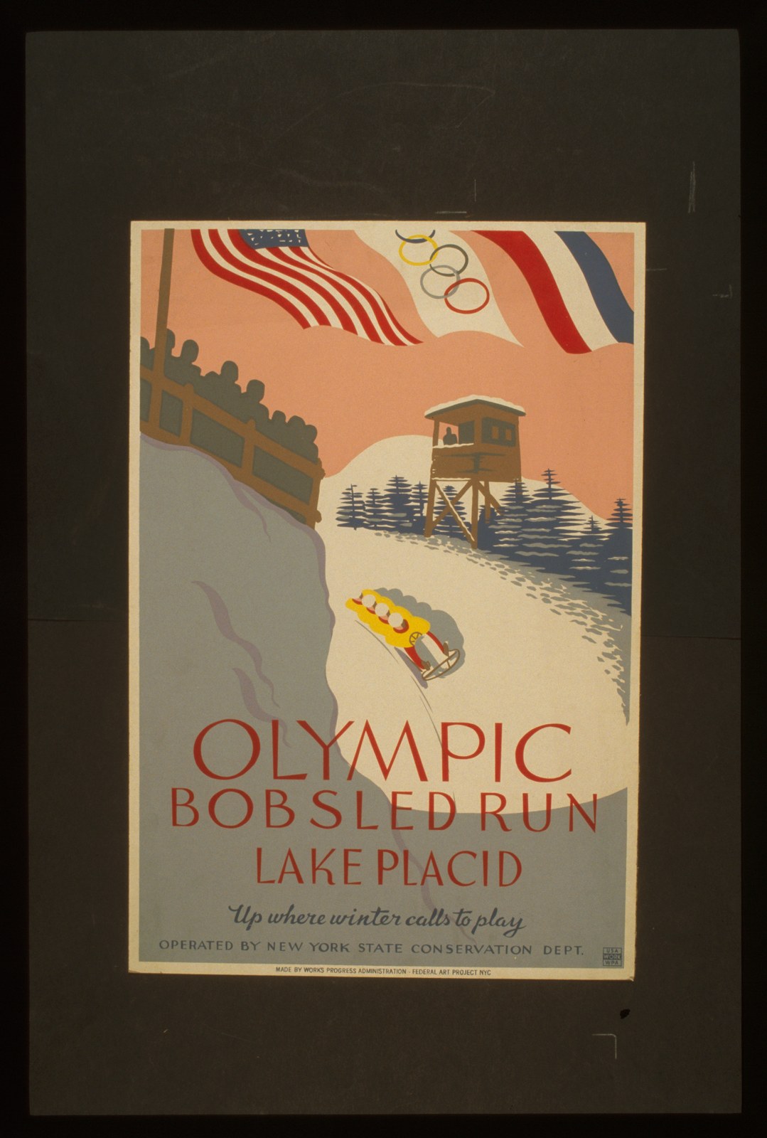
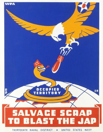
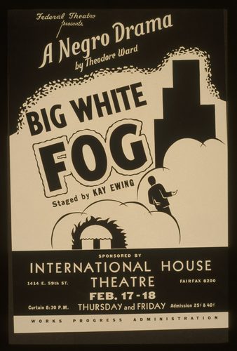
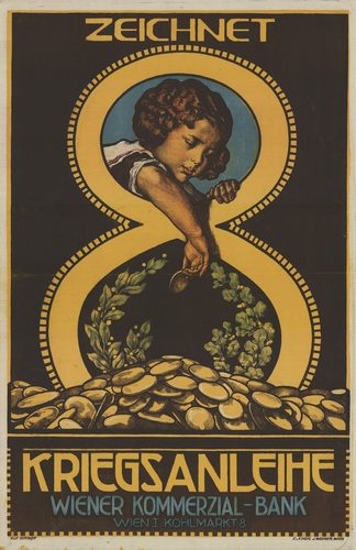
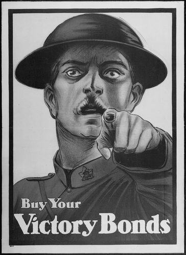
Propaganda art is imagery designed primarily to persuade—to build support for a government, cause, war effort, or ideology—rather than to document, decorate, or explore purely aesthetic questions. It draws on techniques from poster design, printmaking, and later photography and film, favoring bold color, simplified forms, and blunt symbolism over nuance, because its goal is instant, mass-legible impact rather than contemplation. Governments, political movements, and wartime agencies have been the genre's dominant patrons, commissioning posters, murals, and illustrated pamphlets to recruit soldiers, ration resources, demonize enemies, or celebrate a regime's achievements. Unlike most genres, propaganda art is defined by its function rather than its subject matter—it can depict battle, labor, family life, or abstract national symbols, so long as the underlying purpose is persuasion. Studying the genre historically means reading its visual rhetoric—how a poster flatters its viewer, exaggerates a threat, or simplifies a complex situation into one unmistakable image.
The rules of the genre
Bold Flat Color
Large, simplified color fields replace subtle tonal shading, a technique borrowed directly from poster printing, so the finished image reads instantly at a glance or from a considerable distance across a crowded street.
Heroic Simplification
Central figures are stripped of individual detail and rendered as broad types instead—the worker, the soldier, the watchful mother—standing in for an entire group or nation rather than any one specific person.
Direct Address
Figures often point, gesture, or gaze straight out of the frame toward the viewer, turning a poster into a personal command or invitation rather than a scene to observe passively.
Slogan Integration
Bold, condensed typography is built directly into the composition itself, never added as a separate afterthought, so text and image work together, reinforcing one single, unmistakable message the viewer cannot miss.
Scale Distortion
Heroic figures or symbols are enlarged far beyond realistic proportion relative to the surrounding landscape or crowd, visually asserting dominance, strength, or the sheer scale and importance of a cause.
Contrast of Light and Dark
Compositions frequently pit a bright, upward-looking figure against a shadowed or visually diminished opposite, coding one side as righteous, strong, and forward-looking and the other as lesser, weak, or threatening.
Symbol decoder
How to read a propaganda art
- Raised fist
- → Collective strength, defiance, or solidarity with a movement or cause.
- Rising sun
- → A new dawn or era, used broadly across movements to signal optimism and renewal.
- Pointing figure
- → Direct recruitment or command, addressing the viewer as an individual responsible for action.
- Broken chain
- → Liberation from oppression or occupation, a visual shorthand for freedom won.
- Sheaf of wheat
- → Agricultural abundance and the promise of prosperity through labor or a particular policy.
- Factory silhouette
- → Industrial strength and productivity, standing in for national or economic power.
- Star
- → Guidance, ideology, or a movement's guiding principle, placed prominently above a central figure.
The story
Propaganda art has ancient roots—Roman emperors used coins and monuments to broadcast their achievements—but the genre as commonly understood took shape with mass printing, which let posters reach entire populations quickly and cheaply. The First and Second World Wars produced its most studied wave, as nations on every side commissioned artists to encourage enlistment, sell war bonds, and boost morale, developing a shared visual language of bold color and heroic simplification regardless of the cause being served. Totalitarian regimes of the twentieth century industrialized the practice further, integrating propaganda art into a wider system of state-controlled media. The Cold War extended the genre into competing ideological camps, each producing posters that mirrored the other's techniques while opposing its message. Historians study propaganda art today less as a fine-art tradition than as a visual record of how governments and movements have tried to shape mass belief, and the genre remains a case study in persuasive design rather than a celebrated artistic school.
Masterpieces of the genre
| Work | Artist | Date | Why it matters |
|---|---|---|---|
| "I Want You for U.S. Army" (Uncle Sam) | James Montgomery Flagg | 1917 | A direct-address recruitment poster whose pointing figure became a template for the genre. |
| We Can Do It! | J. Howard Miller | 1943 | A factory worker flexing her arm, later reinterpreted far beyond its original wartime purpose. |
| Keep Calm and Carry On | Unknown | 1939 | A British government poster designed for a crisis that never arrived, rediscovered decades later. |
| Loose Lips Sink Ships | Unknown | 1942 | A blunt wartime warning against careless talk, exemplifying propaganda's economy of message. |
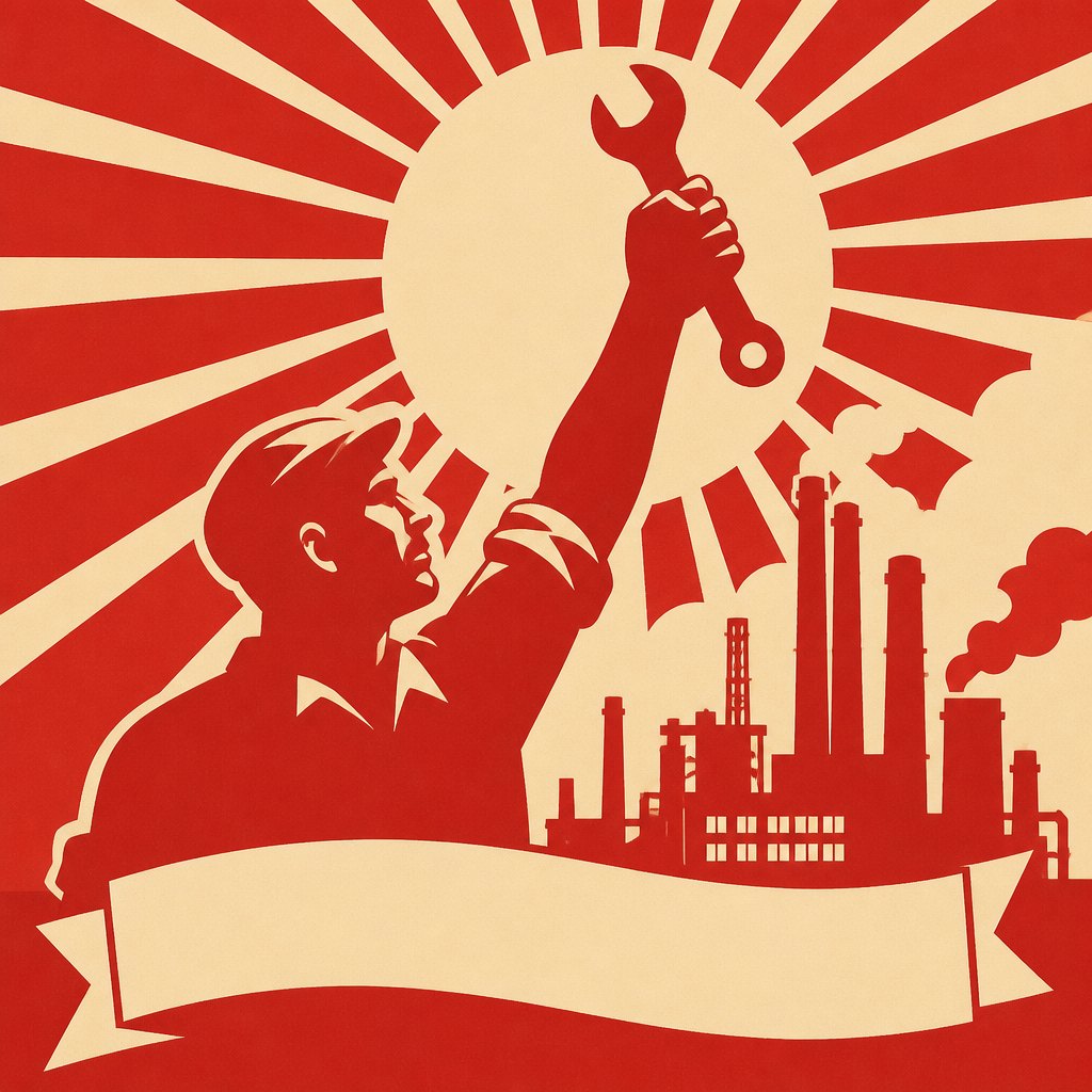 AI-generated
Paint your own
Hang your own propaganda art in the salon
This example was generated from a prompt like: “An imagined poster design showing a simplified silhouette of a factory worker raising a wrench toward a rising sun, bold flat red and cream color blocks, a blank banner below, condensed graphic poster style, no real flags or emblems.”
Open the Propaganda Poster Design generator →The genre today
Propaganda techniques now live mainly in advertising, public health campaigns, and political branding, which borrow the genre's bold color, direct address, and slogan-driven design without always naming the lineage. Digital media and social platforms have replaced the printed poster as the primary vehicle, but the underlying visual rhetoric—simplified heroes, urgent typography, instant legibility—is unchanged. AI image generation makes poster-style propaganda aesthetics easy to reproduce, which has renewed scholarly and public attention to how quickly persuasive imagery can now be manufactured and spread.
Compose your own
Choose one simple, unmistakable message and build the whole image around it—resist adding secondary ideas that dilute the point. Use flat, saturated color blocks instead of subtle shading, and simplify any figure into a clear type rather than a specific likeness. Position a central figure addressing the viewer directly, through a pointed gesture or a direct gaze out of the frame. Integrate bold, condensed typography as part of the composition, not an afterthought. Exaggerate scale for emphasis—a hand, a tool, or a symbol larger than realistic proportion—and keep the background minimal so nothing competes with the central image and message.
Frequently asked questions
What is propaganda art?
Propaganda art is imagery created primarily to persuade—to build support for a government, cause, or war effort—using bold color, simplified figures, and slogans designed for instant, mass-legible impact rather than subtlety.
How is propaganda art different from advertising?
The techniques largely overlap—bold graphics, direct address, memorable slogans—but propaganda art traditionally serves political, ideological, or wartime aims rather than selling a commercial product, though the line has blurred over time.
Why do propaganda posters often show a pointing figure?
Direct address turns a poster into a personal command aimed at the individual viewer, a technique popularized by wartime recruitment posters and copied widely because it makes viewers feel personally responsible.
Is propaganda art considered fine art?
It's studied mainly as visual rhetoric and design history rather than celebrated fine art, though its posters are widely collected and exhibited today as artifacts of how mass persuasion has worked.